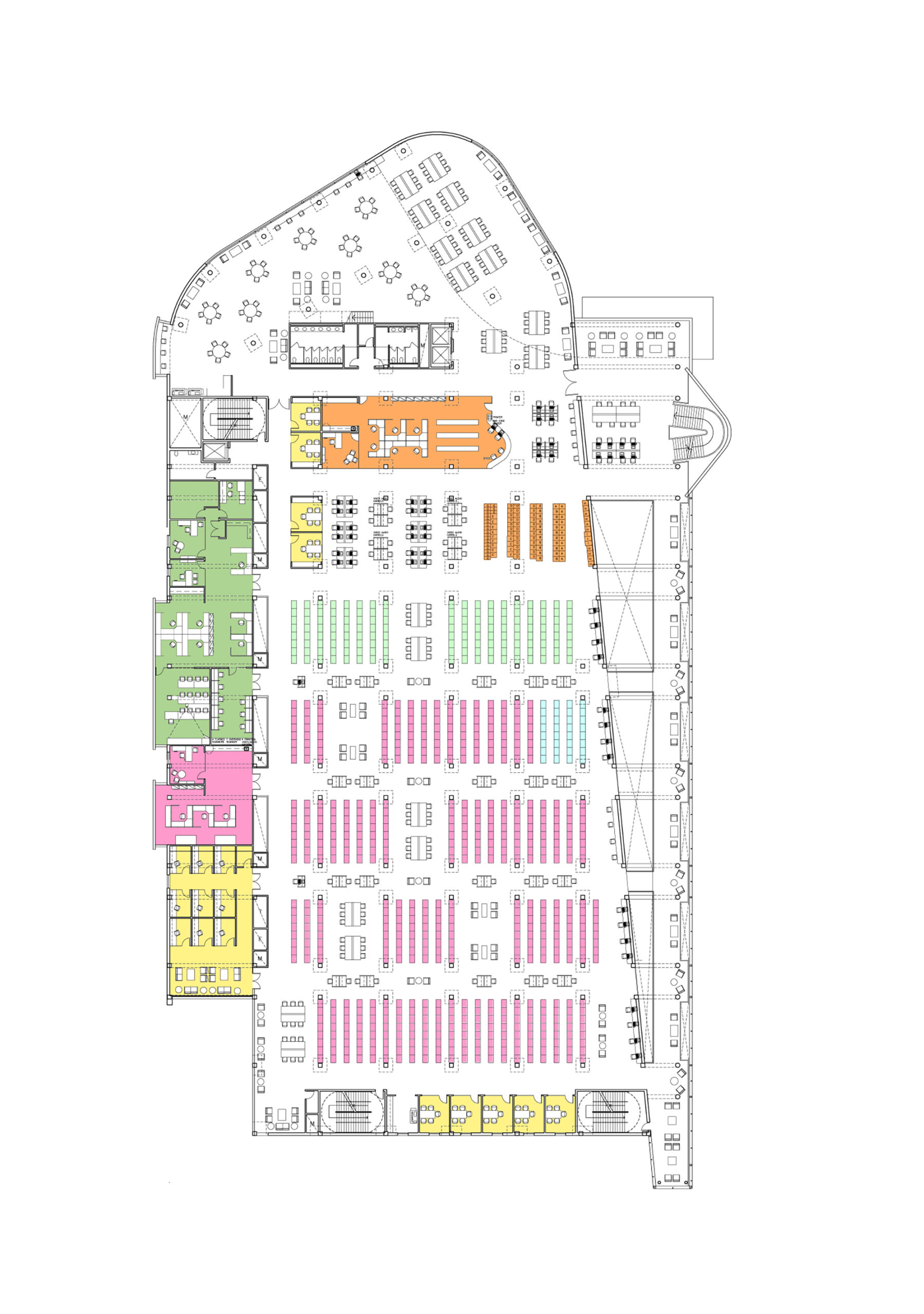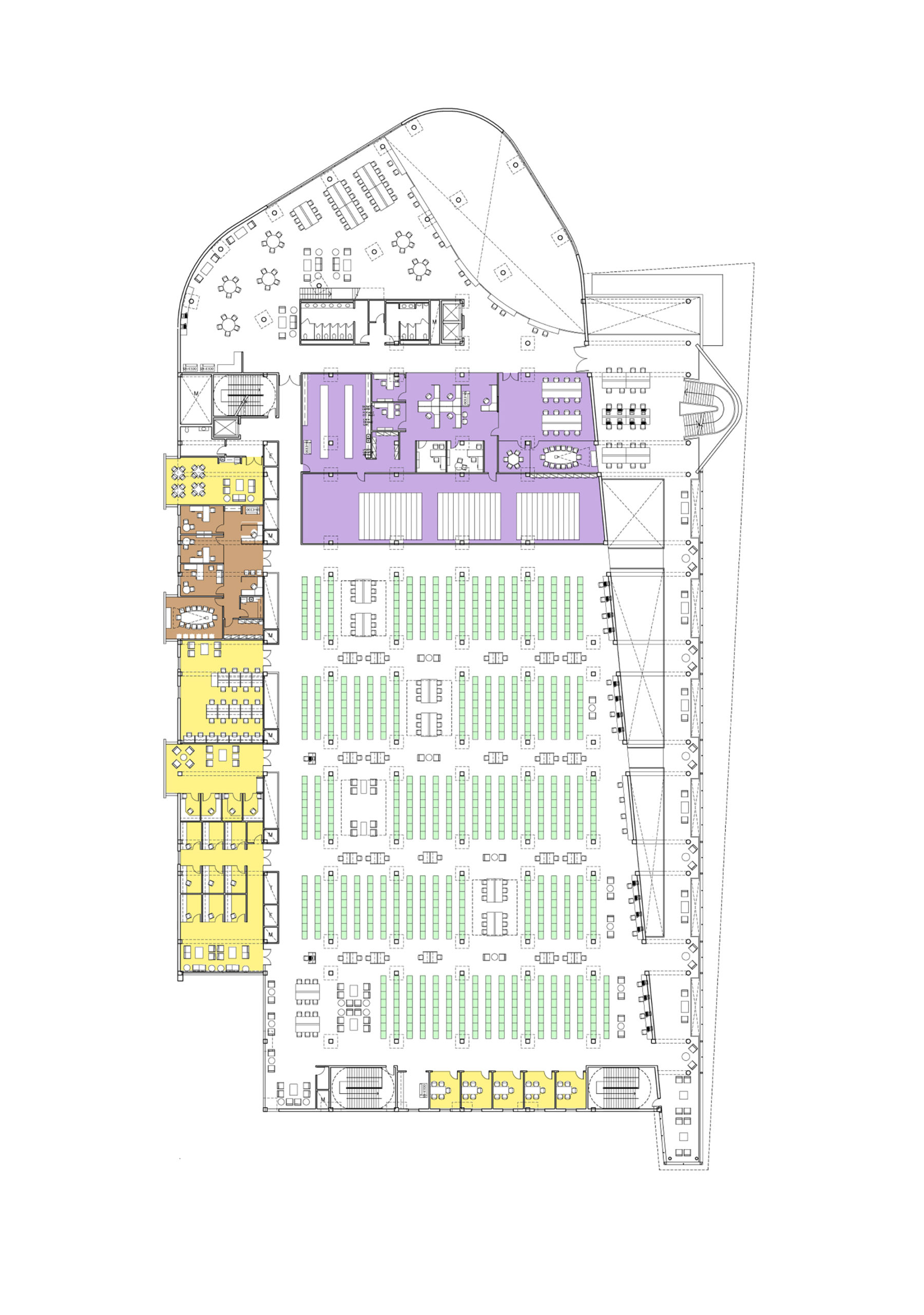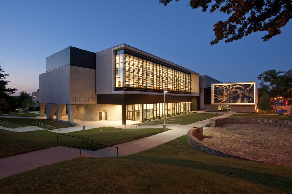
University of Missouri Kansas City Miller Nichols Library
Kansas City, MO
 Sasaki
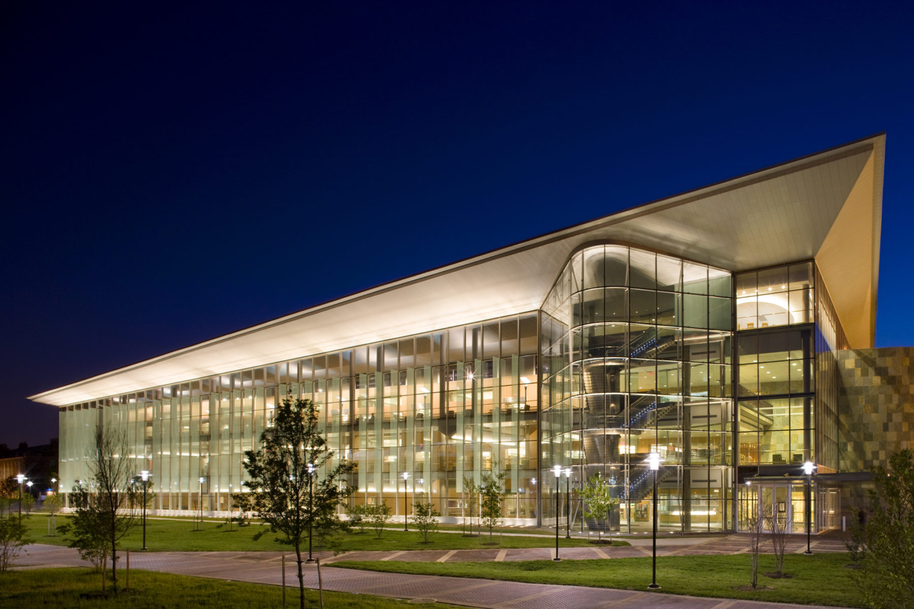
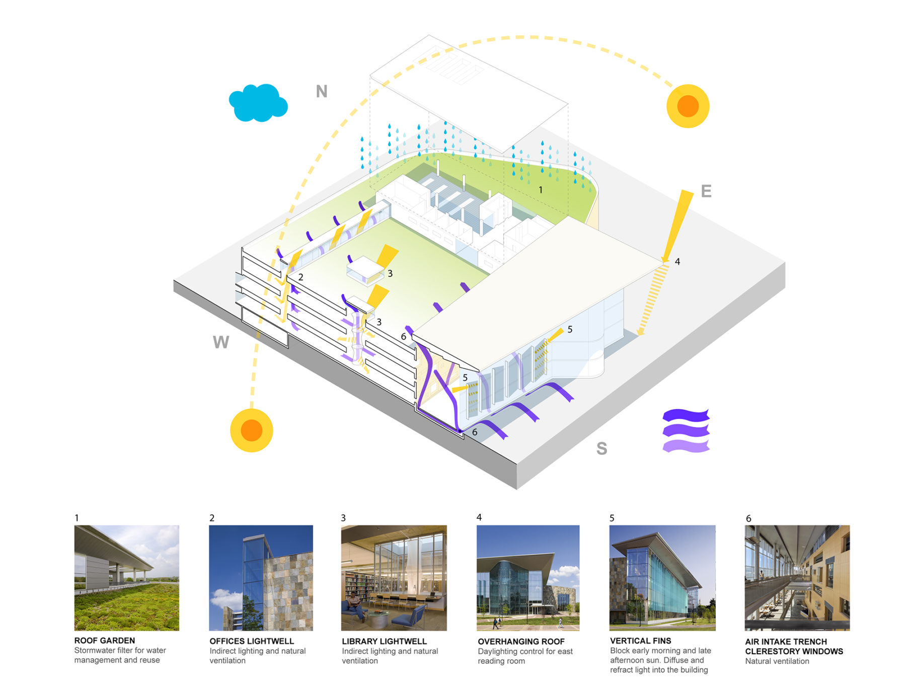
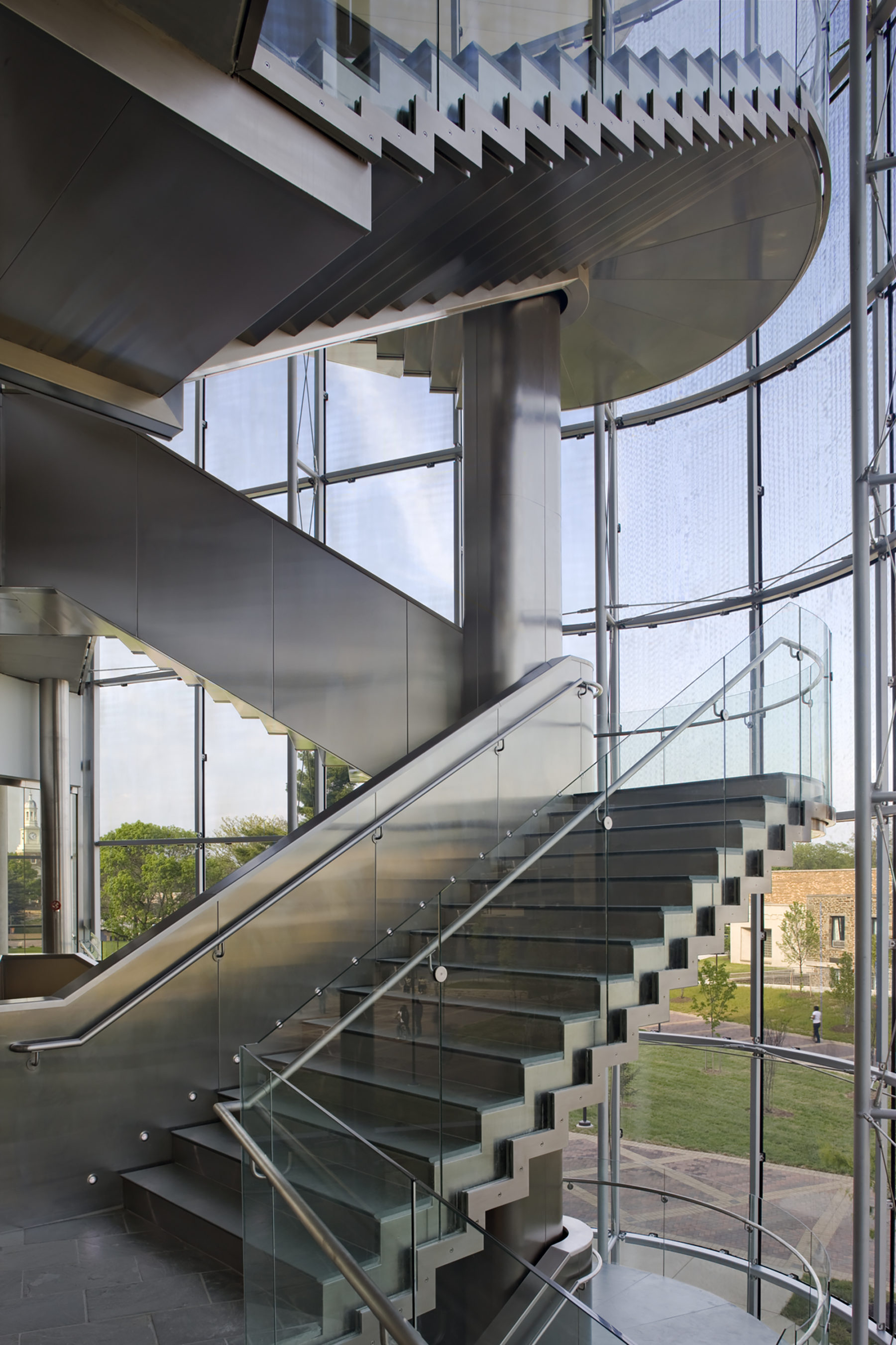
The many goals for the new library at Morgan State University included establishing the site as the new center of the campus, providing flexible interior spaces, accommodating the university’s art collection, improving relations with the residential neighborhood, demonstrating a sense of environmental responsibility, and instilling pride in the institution without being aloof or intimidating. Sasaki met and exceeded these goals for the Earl S. Richardson Library, which has become a signature building of the campus. The library balances importance and pride with transparency and welcome. As directed by the university, the building is “impressive, not oppressive.”
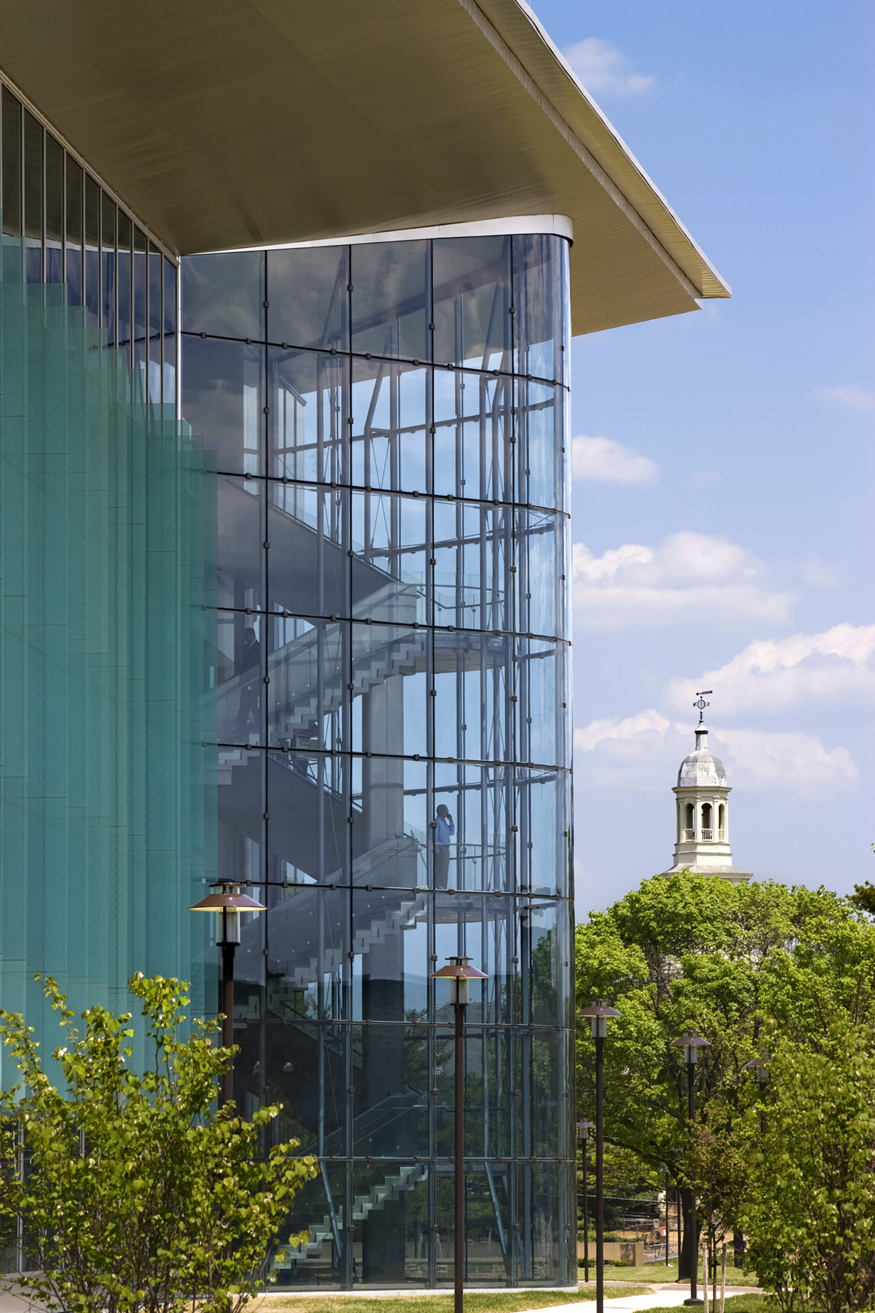
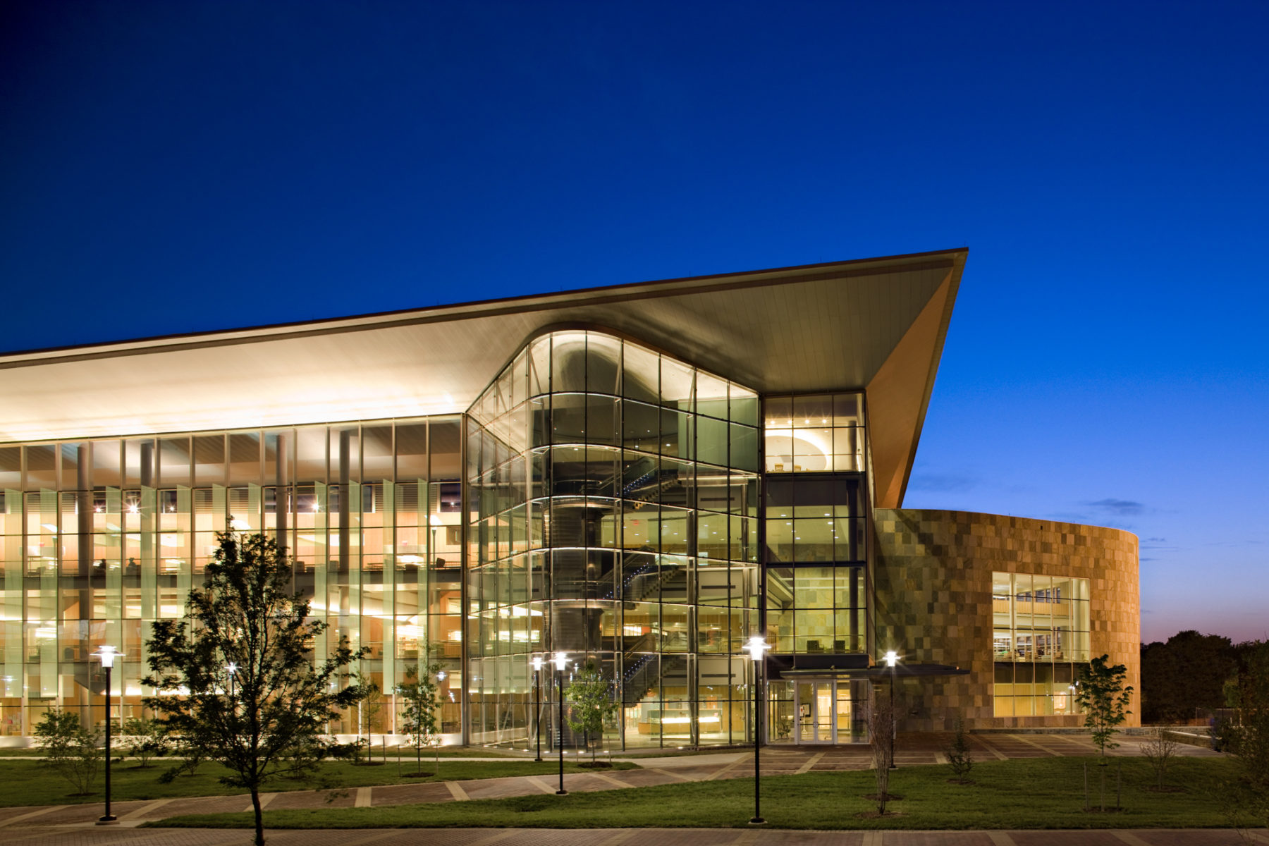
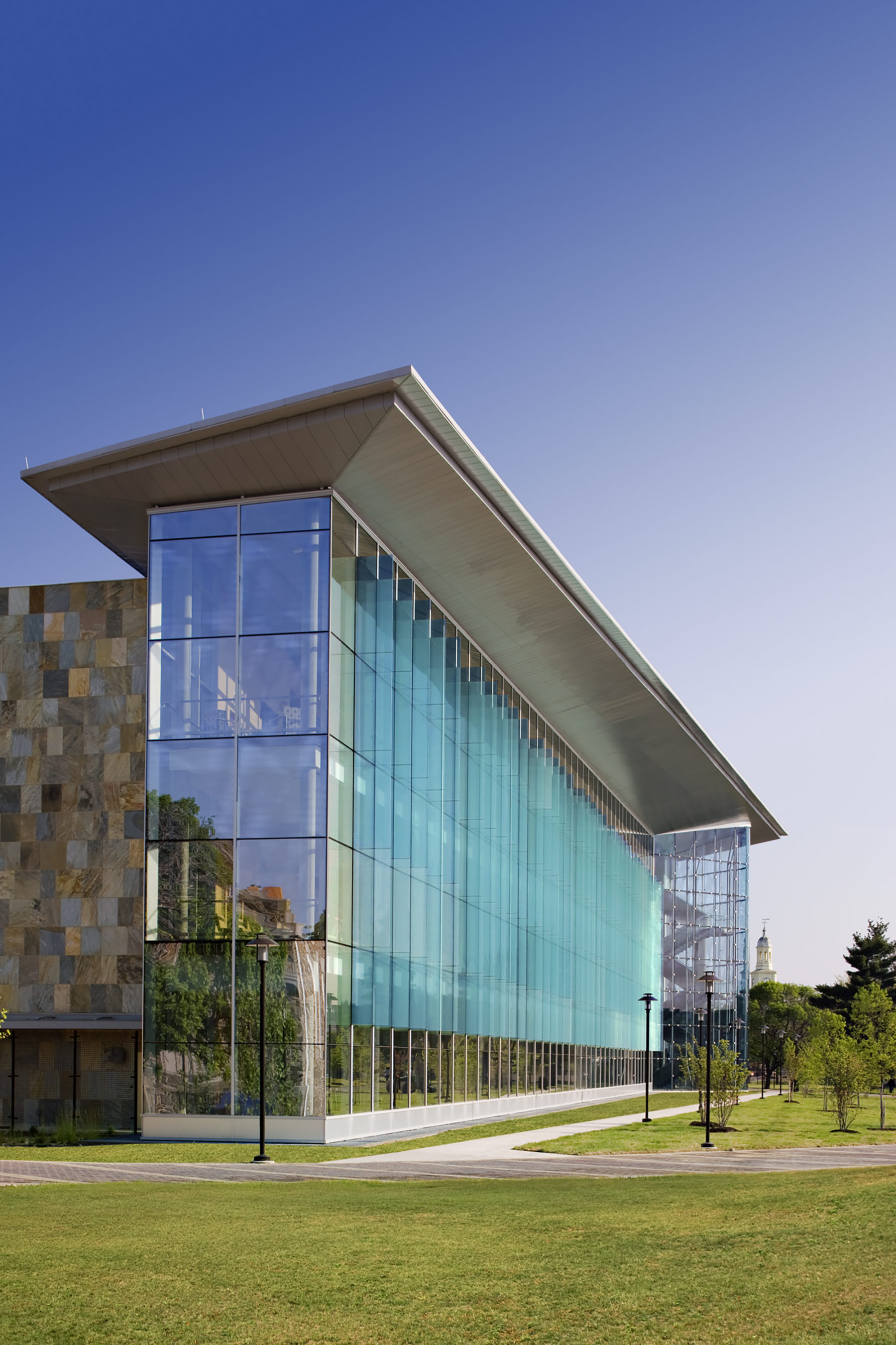
The building is multidirectional, with no explicit back or front. To the north, it visually connects to the academic campus, and specifically to Holmes Hall—Morgan’s most iconic building. To the east, the building serves to strengthen and animate the pedestrian mall with a broad glass curtain wall that gives a sense of openness and animation—underscoring the library as the new epicenter of campus. The west elevation of the library creates an edge between the campus and the adjacent residential community. Programming along this facade was purposefully dedicated to nine-to-five staff offices, thereby minimizing noise and disruption to the community. In addition, the scale on this façade shifts in order to make the building seem smaller than it actually is.
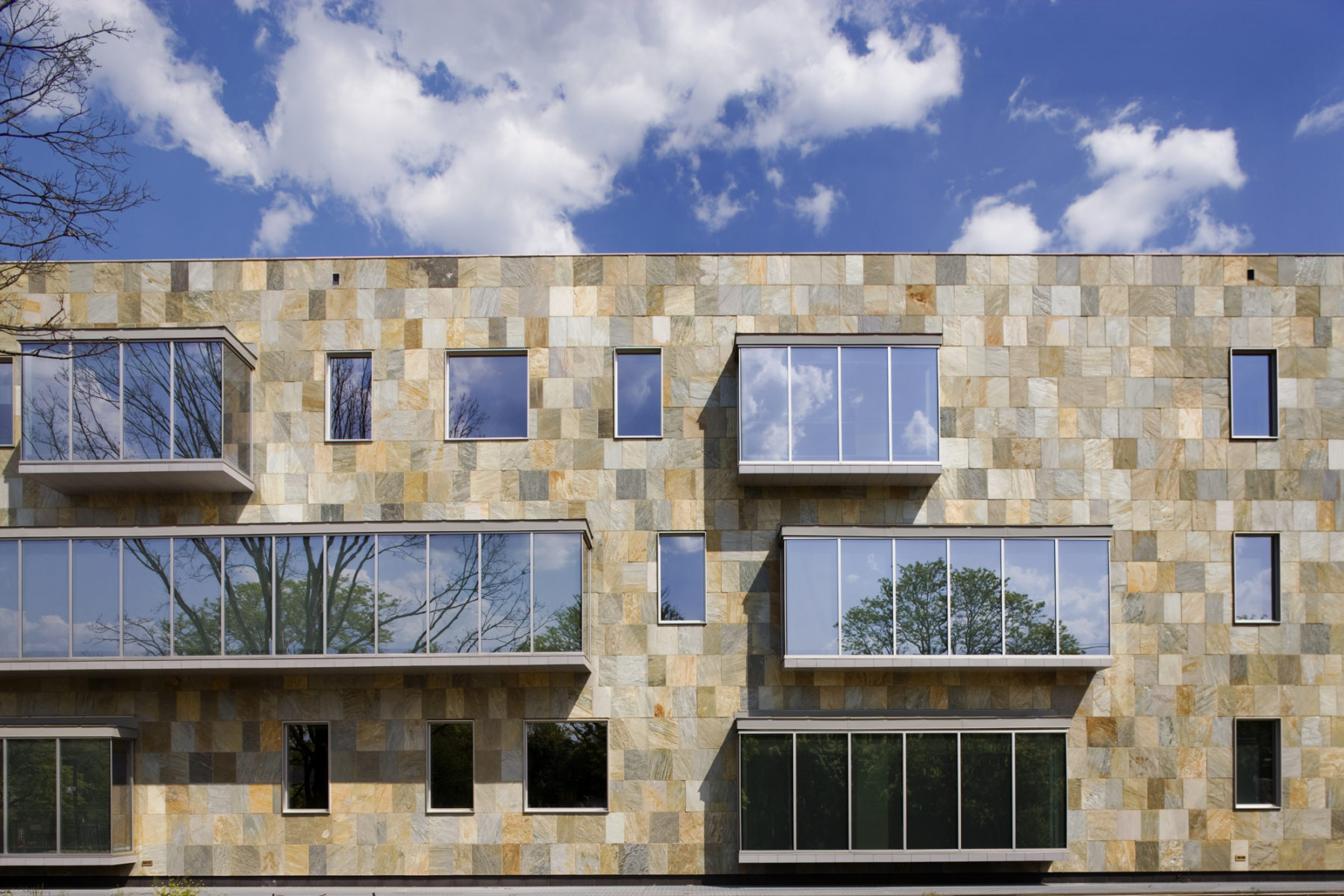
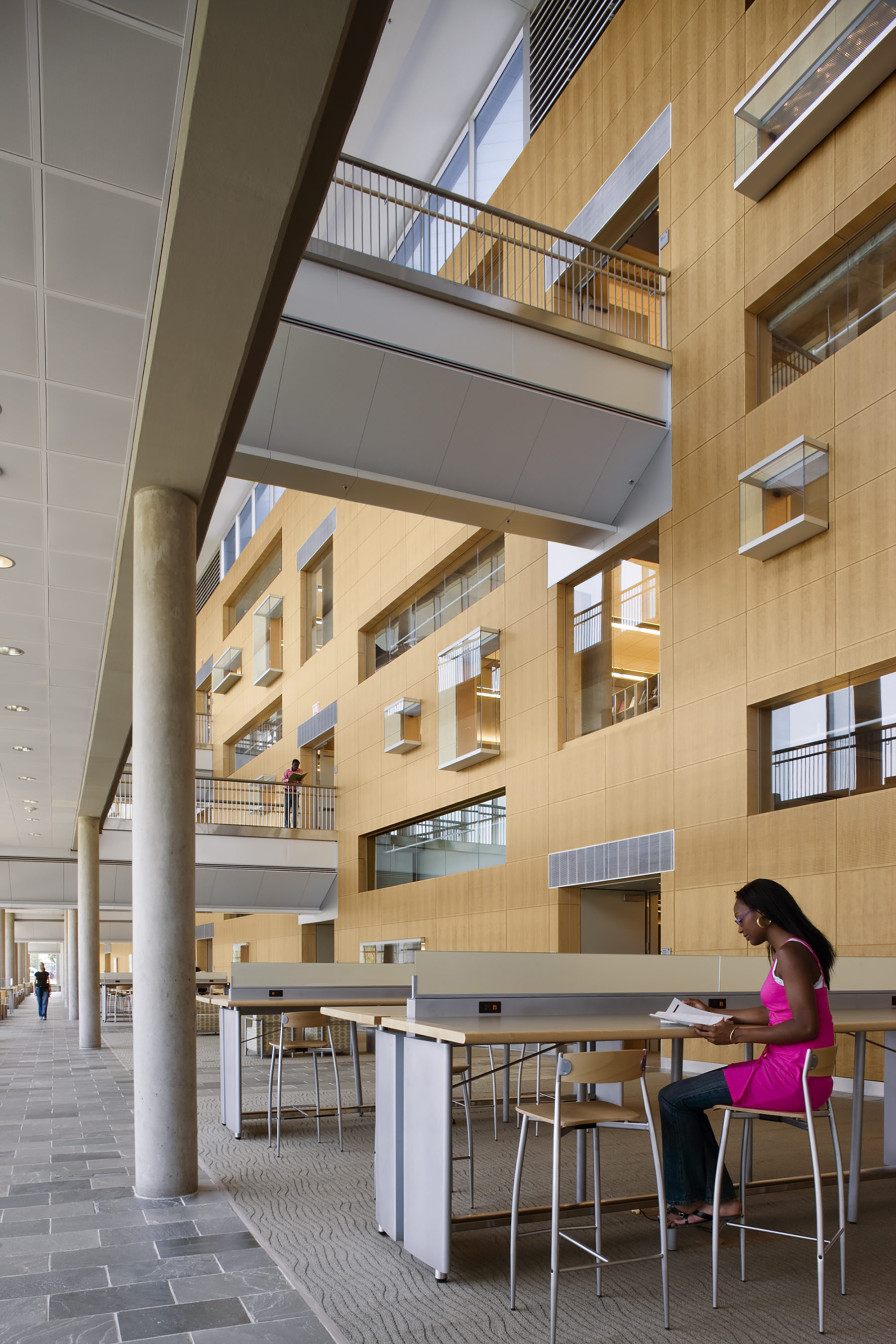
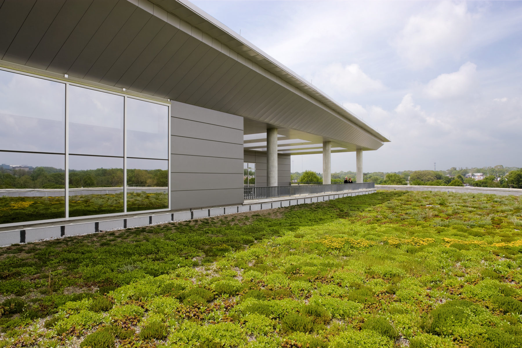
A curvilinear wing wraps around the northern and western edges and is topped with a sedum green roof, which can be viewed from key interior spaces. Student reading areas are placed along a broad interior loggia set behind the glass. The facing wood wall is punctuated with windows and display cases in an orthogonal—yet playful—pattern. The glass display cases, visible inside and out, integrate the institution’s collection of African and African-American art and contribute additional visual interest to the facade.
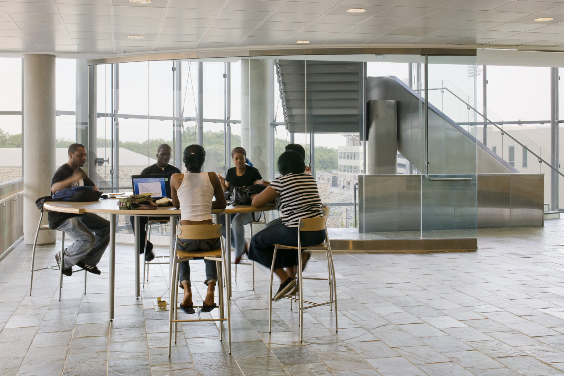
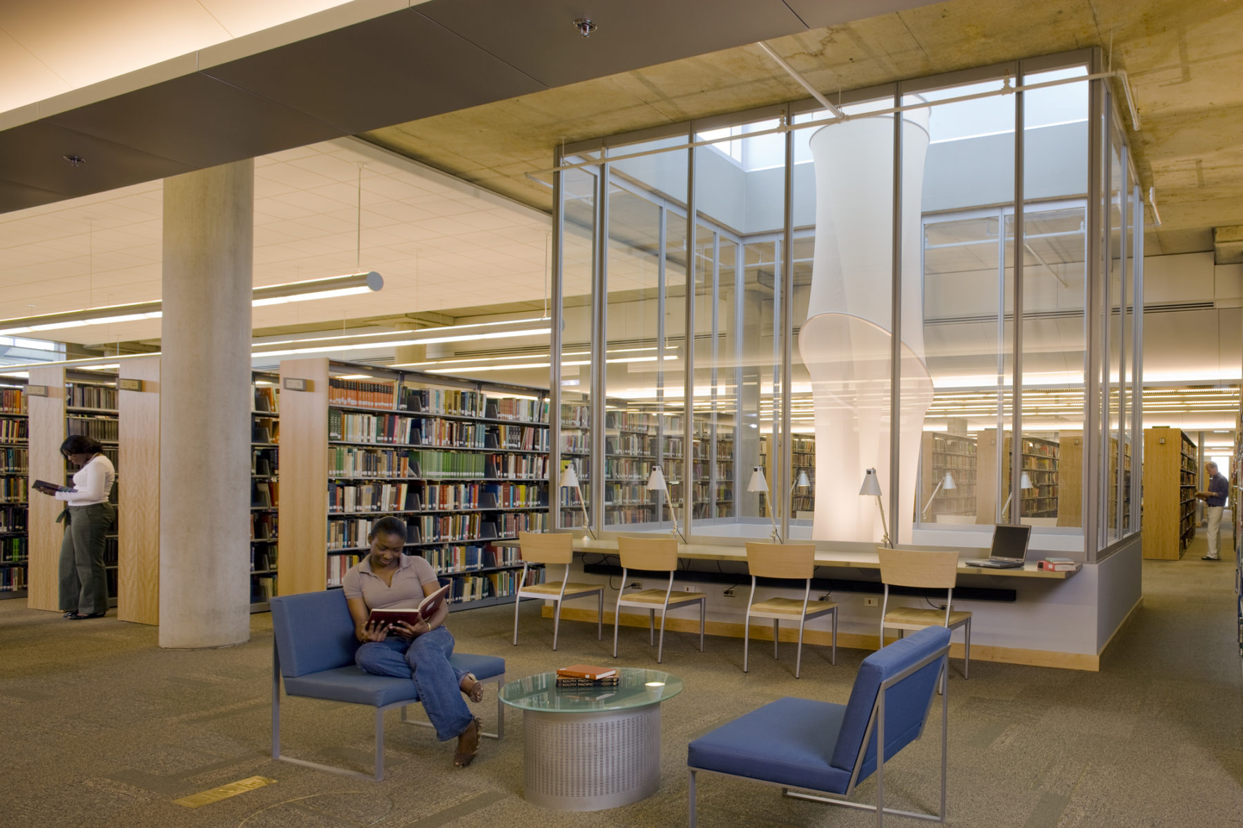
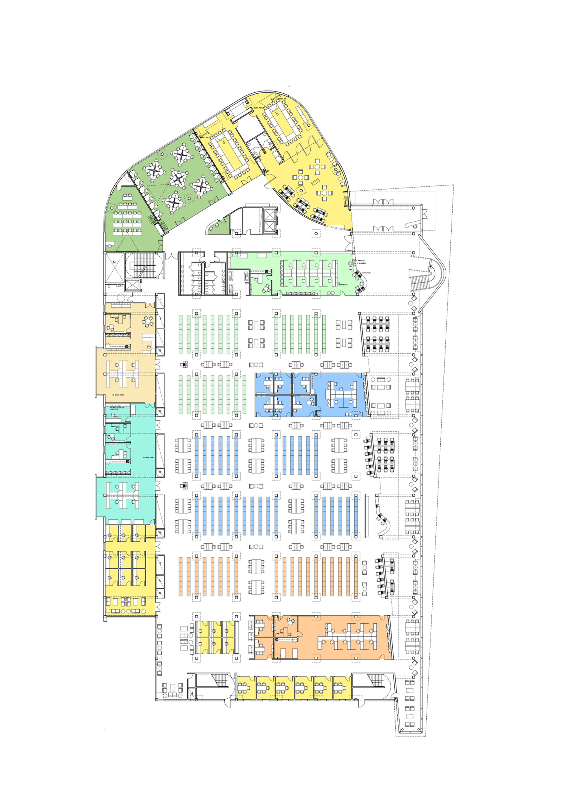
A key driver for the design was the desire for the building and its systems to be inherently flexible in order to accommodate changes in library services and pedagogical evolution. After extensive study and testing, a system of 12-foot by 27-foot modules became the basis for the entire interior layout. Divisible by three, these modules match the three-foot shelving modules and allow stack areas to be easily converted into classrooms, seminar rooms, or open group study spaces, as well as back to stack space as collection needs require. The building also has spaces to accommodate the diverse ways in which Morgan students study—an honors area for those who prefer private study, as well as group study areas for conversation and collaboration.
