Data-Informed Design, a Sasaki Perspective in SCUP Journal

 Sasaki

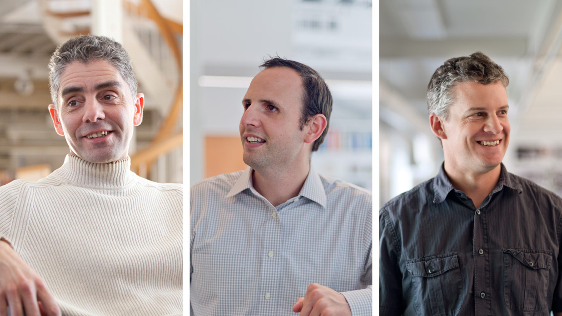
In the following Q&A, Claire Turcotte, managing editor of SCUP’s journal Planning for Higher Education, speaks with Sasaki principals Vinicius Gorgati, AIA, LEED® AP, Tyler Patrick, AICP, and Ken Goulding, [pictured above, left to right] about data-informed design. The three experts offer insight on the role data plays in higher education campus planning, the types of tools used during this process, and where data will take us in the future, as illustrated by a case study of Sasaki’s planning work at Brown University.
This piece originally appeared as part of a series of SCUP 50th Anniversary Interviews in the July-September 2015 issue of Planning for Higher Education Journal:
Claire Turcotte (CT): I think this is a very interesting topic. Gentlemen, could you please explain the technique of data-driven design?
Vinicius Gorgati (VG): One of the key points of the data-informed approach at Sasaki Associates is that data is viewed as one more key component within a conversation around design. One of the elements of this conversation is that design is always rooted in the mission and vision of each institution. As translators of the culture of a place, we see vision and mission as very important attributes.
A second element is the character and quality of the place. Physical attributes are as important at the planning level as they are at the building- and landscape- design level. The third component for us is the financials. Our planning anticipates the implementation issues associated with any vision. Working within the financial constraints and capabilities of an institution is critical to success. What we have found is that data brings you a leveler. In canvassing the constituencies you get a reading about the place, the culture, and the aspirations that goes much deeper than what you might gather from individuals separately.
More importantly, data can be a common platform for having a conversation across diverse mind-sets and different points of view. It brings a level of clarity and commonality to the conversation. That is not to say that it overrides all the other aspects of ambition, vision, and the technicalities of building quality space, but it does bring a balance to the more subjective aspects of planning and design.
CT: Thank you for your explanation. Can you tell me how this works? Do you have to have special software? What’s the technology?
Ken Goulding (KG): One point: the term “data-driven design” in some ways may be a little misleading in that it suggests that the data is somehow creating this design almost independently. I think the term “data-informed design” may be more apt because it really is just another consideration. It’s obviously a very important consideration. We want to make informed design decisions. We want to be able to understand what all the constraints are on the design.
People have been doing data design before we had computers. You’re synthesizing information. You’re understanding that information in order to make better design decisions. You don’t need a special tool for data-driven design. However, the more tools at our disposal, the more information of the correct quality we can bring together as part of the design process to inform both ourselves, as designers and practitioners, as well as the client and stakeholders. Data plays a very important role in all of that.
For example, we must understand how people are using a campus before we make major decisions that will impact everyone’s lives. If we find that there is a hole in the data and there is no existing tool that we can leverage to fill that gap, we’ll build a tool ourselves.
Tyler Patrick (TP): Just to add to that, I think we always start with a question that we’re trying to answer, and then we try to understand where data might exist to answer that question. Sometimes it exists. But, as we know, data can sometimes be fairly inaccessible. The institution might have data but it may not know how to access it. We can work with the institution to develop the tools to help visualize that data and build a common platform of understanding of existing data.
Alternatively, we sometimes need to help create the data set—whether through crowdsourcing or fielding different surveys. We cull the data and then build the accompanying visual aspects of it to help share it back with the institution. As Vinicius said, it gives us a little bit more of an objective element to hang our hats on as we move through analysis and design iteration.
CT: That’s very helpful. Yes, I can understand that you have to start with a question, like what sort of land is available for a new building or is there vacant land available for a new building. Location is key. What can you tell me about the Brown University case with the engineering building?
TP: We conducted a planning study with Brown University. The location of the engineering school was one of the critical questions that we faced.
CT: Yes, I’m sure that all the information that you could gather would be helpful in the final decision making on a campus like Brown.
TP: Absolutely. We started with a question: Should the School of Engineering stay in its current location on the seemingly space-constrained hill, or should it move to a downtown location to leverage other types of partnerships?
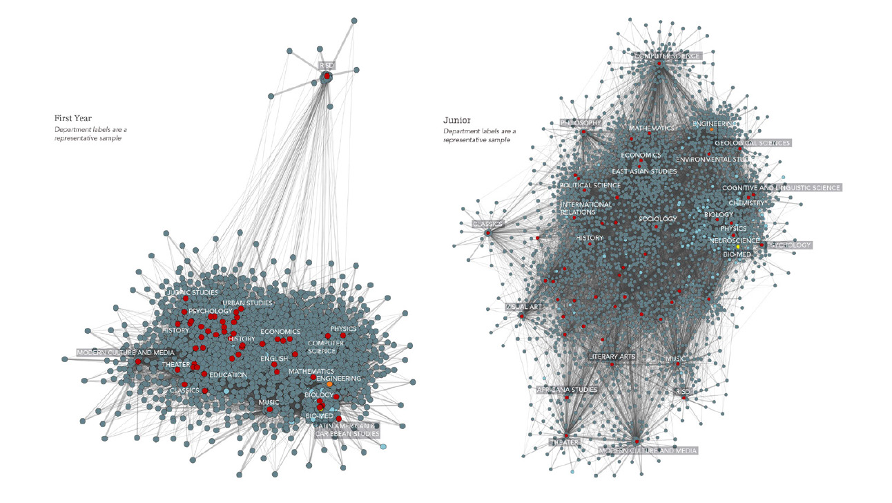
Working with the Sasaki Strategies team, Ken and others developed a way of looking at two key aspects of data. The first was examining course data to understand where students were taking their courses—the interdisciplinarity of a typical student course schedule. Understanding this dimension helped us to factor in class change time and how far a student could travel between classes.
If you relocate the engineering school, what impact would that have? Were those classes self-contained, or were engineering students also taking classes in multiple departments? When we did the visualizations based on that data (figure 1), we understood that student schedules were highly integrated across departments. The open curriculum at Brown drove a lot of interdisciplinary connections.
Figure 1: Visualization of Student Course Enrollments

Visualizations of course enrollments for both first-year students (left) and juniors (right) illustrate how student schedules are interdisciplinary and highly integrated across departments. Open enrollment in the first year creates a tightly interconnected cluster of students that relaxes later as students concentrate their education.
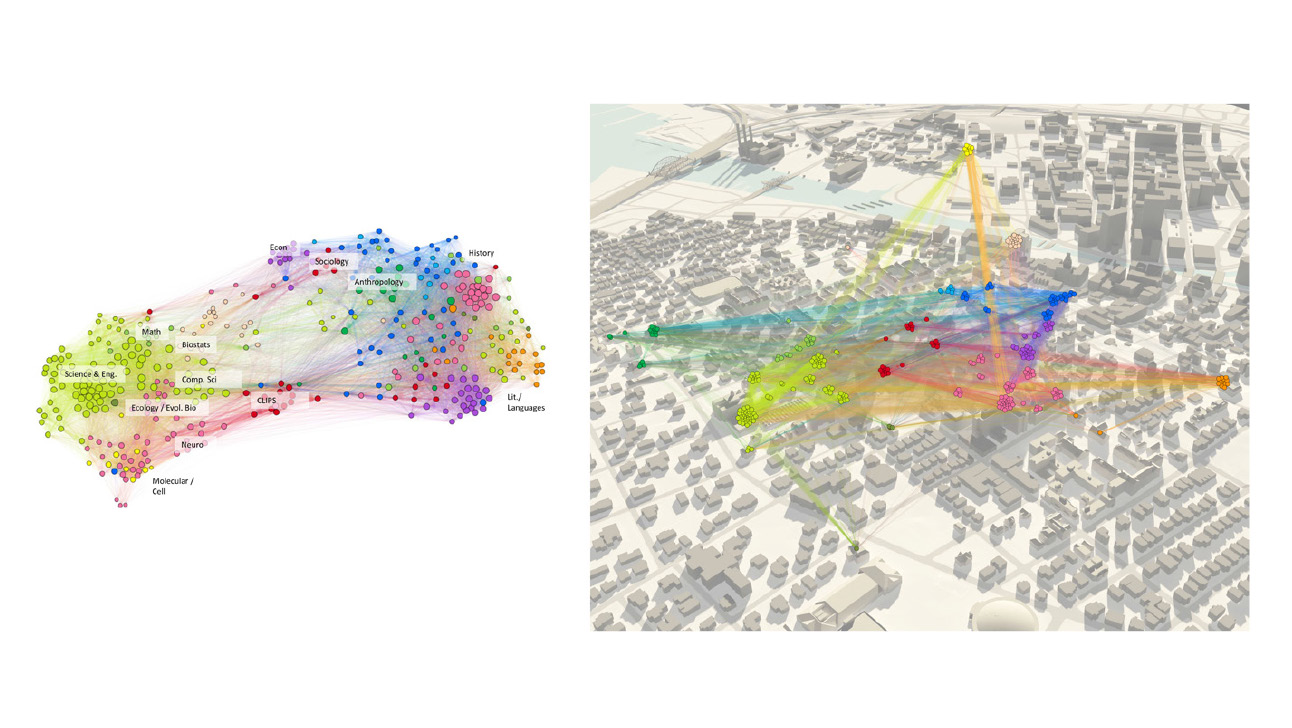
That was one approach to answering the question. The second was to uncover to what degree faculty were collaborating. We did a collaboration survey asking faculty to rate the level of their collaboration—high, medium, or low—with other departments on campus. From those responses, we saw very clearly that there was a more science, technology, engineering, and mathematics (STEM)-related cluster and a more humanities-related cluster.
Within the STEM-related world, engineering was really the center around which biology, chemistry, math, and other departments interacted. To move engineering off of the hill, across the river from all those partners, would—as it became clear—further isolate them from the disciplines with which they interacted. That might have caused negative consequences.
The third tool we developed was a capacity study of the hill to help Brown understand how much space really was available to develop. Those three analyses together drove us toward a solution that located a new engineering building on the hill in the traditional engineering district.
CT: That’s an extremely interesting case, and I think it definitely proves your point of gathering all this important data, [such as] the travel distances that the students must take as well as the faculty. I can see that this was a well-studied solution with respect to the location of the engineering building. Is this applicable to other campuses? Can you use this technique at other campuses either for site location or for some other question?
VG: Yes, and what I find fascinating about the example that Tyler just described is that while the program and the courses are well known to the faculty and the students, it’s the manifestations of those programs that are not immediately transparent. When you use these tools as Ken was describing, it allows you to understand the interrelationships between these elements on a visual level. In other words, it’s one thing to look at data. It’s another thing to do these collaboration and relational diagrams because you can literally see it (figure 2). You see that if you move an entity like, in this case, the School of Engineering out into a different part of the campus, you are in fact fighting a number of the elements that are key to its success, be it the curriculum or the interdisciplinary activities.
Figure 2: Visualization of Faculty Collaboration Patterns and Geography

These diagrams group departments by collaborations and are colored by geography. Dots represent faculty with strong collaboration patterns but disparate geographies (left), which we can see mapped on the campus geography (right)
In our work, analyzing data and establishing relationships are common to a number of institutions. Of course, they manifest themselves differently. As a platform of inquiry, these strategies are applicable across the board. We’ve done similar exercises at places as distinct as the University of Akron, Rutgers University, Dartmouth College, and Johns Hopkins University. I think that, as Ken well said, this is not just an issue of software and of equipment. It’s an issue of understanding what kind of mechanisms you have available and should deploy. We have in many instances encountered questions from clients around particular needs and been asked to custom-develop tools and the strategies to map them out to see what we could learn.
KG: Sometimes, I think it’s really just a case of taking the data that you’re given and essentially making visual storytelling through that data to just illustrate what the problem is. Sometimes that really helps build the case. We’re often using tools to do visualizations and abstract analysis, making the problems visibly graspable to everybody in the room so that you can start to think about those problems as something more tangible that you can tackle rather than just charts or numbers in a spreadsheet.
Another thing we find very compelling is being able to move seamlessly between visualizations that are spatial by overlaying information on the campus. You can see the tension between an abstract diagram that shows how Brown’s engineering department was at the center of everything, for example—and then you can overlay that and spatially show what it would look like if you moved engineering across the road. It also helps bridge the worlds of crunching numbers and design because you’re actually representing information in the same language—a visual language on plans and maps.
TP: We do not take a one-size-fits-all approach. We think about the problem and find a solution to address a college or university’s specific needs. For instance, while at Brown, we looked at the course schedules to answer one question. Ken was involved in another project at the same time with Rutgers University where they looked at course schedules across multiple campuses to understand the shuttle patterns of students moving around. It became this network analysis of where all the students were moving based on course schedules. That one was really more, as Ken said, about the spatial relationship and the impact of the course data, whereas at Brown the primary initial analysis was looking at things more abstractly to understand the push-and- pull tensions.
These projects do start to inform one another. Thinking about how we can use the data in different ways to solve new problems and create new tools to help customize them for institutions is something that we’re all very interested in.
CT: Where do you see the future of data-driven design going? What are the challenges? What are the opportunities?
KG: I think that probably the most obvious challenge is that we’re moving from a time when it’s hard to come by data—we have to generate a lot of data—to a time when we’re really going to have more data than we can look at in its entirety. It’s a case of figuring out what data is going to be relevant to the decision-making process.
CT: There’s enough information and data out there these days. Also, the other thing is that the campus environment is changing so rapidly with the influences of technology and other changing learning environments and so forth. For you, trying to solve a problem for a client, I expect it’s a little bit like a moving target. You’re always trying to catch up.
VG: For me, one of the interesting aspects of working with data is that beyond just capturing where we have been it also has the potential to reveal promise for the future. We can ask, moving forward, what are the great problems that the world faces, and how can this help us create a platform for continuing discussion and innovation. It’s a tall order, but thrilling because looking at data can bring up the unexpected. This visioning becomes a very exciting opportunity.
CT: These techniques are much more valid than just a hunch or some sort of intuitive guess in terms of solving a problem.
KG: I think what’s important is being able to balance both of those approaches. Your hunch is also going to inform you if the data just doesn’t make intuitive sense. That can often reveal important patterns in the data that you otherwise might have missed. At the same time, I think the data can help you dig deeper and discover whether or not your hunches are on target.
Balancing those two conflicting elements is important because I think too often people are trying to be almost purist about coming up with an answer based on the data alone. In fact, more often than not, we’re residing squarely in that space between human decision making and computers crunching numbers, recognizing that both human brains and computers do very important things very well.
CT: Both approaches are necessary in sound decision making.
VG: Designers dwell in that space between information and creation. Ably harnessing data can add fuel to energize that space. We realized that delving into data provides an additional layer of robustness to our problem solving and decision making. While data certainly hasn’t become a solve-all, data visualization and analysis fit well with the way we like to think about problems and create successful outcomes with our clients.
We love to see our clients see their own institutions, campuses, and constituents in wholly new ways. It’s a powerful revealer of truths that can set a project off on a much more efficient course toward a fitting solution. We are able to cut through some of the initial confusion about where the problems really lie, what’s at the root of those problems, where we are imagining limitations or challenges that don’t exist, or where elegant solutions sit waiting to be discovered. It’s an exhilarating proposition for us.
CT: Certainly, you are problem solvers—that’s for sure. I think that we can conclude our interview for today. I thank you all for all this information. It’s been a very, very interesting and informative discussion.
SASAKI ASSOCIATES is a planning and design firm based in Watertown, Massachusetts. SASAKI STRATEGIES is a dedicated team charged with bringing analytical rigor and nimble technology to design decision-making. Their strategists specialize in visualizing abstract concepts and uncovering patterns to bring people together in shared understanding of complex problems.