Built Environment Plus Highlights Restorative, Inclusive Design at UMass Boston’s New Harborwalk
Sasaki landscape architect Ian Scherling led a tour through the site, pointing out key design features
 Sasaki
In 2012, while working on a 77-acre coastal landscape project at the University of Massachusetts Boston, our client gave us a directive that changed everything. “No stairs!” Dorothy Renaghan said. UMass Boston is the only public research university in Boston and is the most diverse in the region. To Dorothy, this project was an opportunity to change the language of design on campus to one that was barrier-free and served not only the campus, but also the public.
Today, 33 years after the signing of the Americans with Disabilities Act, Dorothy’s directive is more relevant than ever. What she really said that day was, “Be more creative—check your default.” In response, our design evolved and we wove the university together with the Dorchester community at the edge of the campus using gently sloping pathways and gathering places.
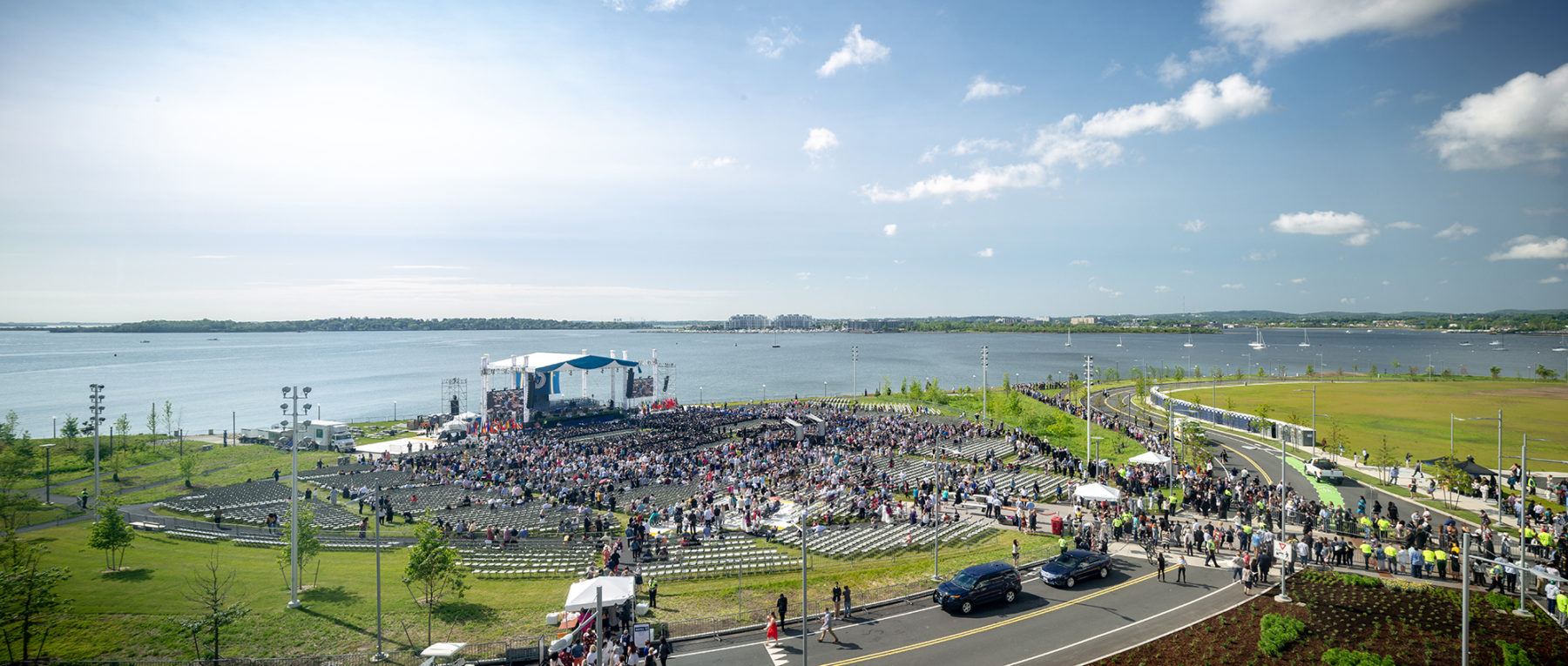
Sasaki’s design for the University of Massachusetts Boston creates over five miles of new, barrier-free walkways that connect the campus to the Boston Harborwalk, making everyday visits and large-scale events accessible to all
Of course, none of us want to design places that marginalize people. The mission of the American Society of Landscape Architects is to serve and protect the public welfare through the design of outdoor spaces. Their recently published Climate Action Plan is rooted in ideas of human equity and cultural empowerment. Human-centered design must be, therefore, at the heart of everything we do and how we do it.
Human-centered design must be at the heart of everything we do and how we do it.
Universal design is a process that incorporates a cross-section of stakeholders; inclusive design is another term that you’ll find used interchangeably and sometimes preferred over universal design; human-centered design is the outcome of a Universal Design process—and something that considers the human body, all our senses and movement needs, and applies them to the built environment.
We humans need connection. We want to live in a community with opportunities to flourish in our own unique ways. Designers create a physical framework for that community, but many default design tools don’t take into account the full range of individuals who will interact with these spaces. How can we remove undignified barriers from our designs and design with a new default?
The idea of human-centered design is not new. After the ADA’s passage in 1990, landscape design education and professional practice focused intensely on how to design with these new tools. However, only now are we as a profession approaching ADA in a healthy and holistic way—not as laws restricting our creativity, but as opportunities to create inclusive experiences within the landscape.
Study any number of Frederick Law Olmsted’s designs and you’ll find a creative, graceful, and innate understanding of the human experience.
“So long as considerations of utility are neglected or overridden by considerations of ornament, there will be no true Art,” Olmsted wrote in his Papers. His attention to intrinsic physiological, social, and psychological needs is evident in the circulation networks seen in the 1860s plan for Prospect Park, the 1886 plan for the University of California Berkeley, and the 1874 design for the U.S. Capitol, where pathways were designed to an intuitively comfortable 1:20 (five percent) grade. Overlay this with carefully considered ideas of planting—arranged to guide pedestrians, separate people from carriages, and frame views to the Capitol’s dome—and you have a plan with established principles of art, comfort, and utility, all focused on the human experience of place.
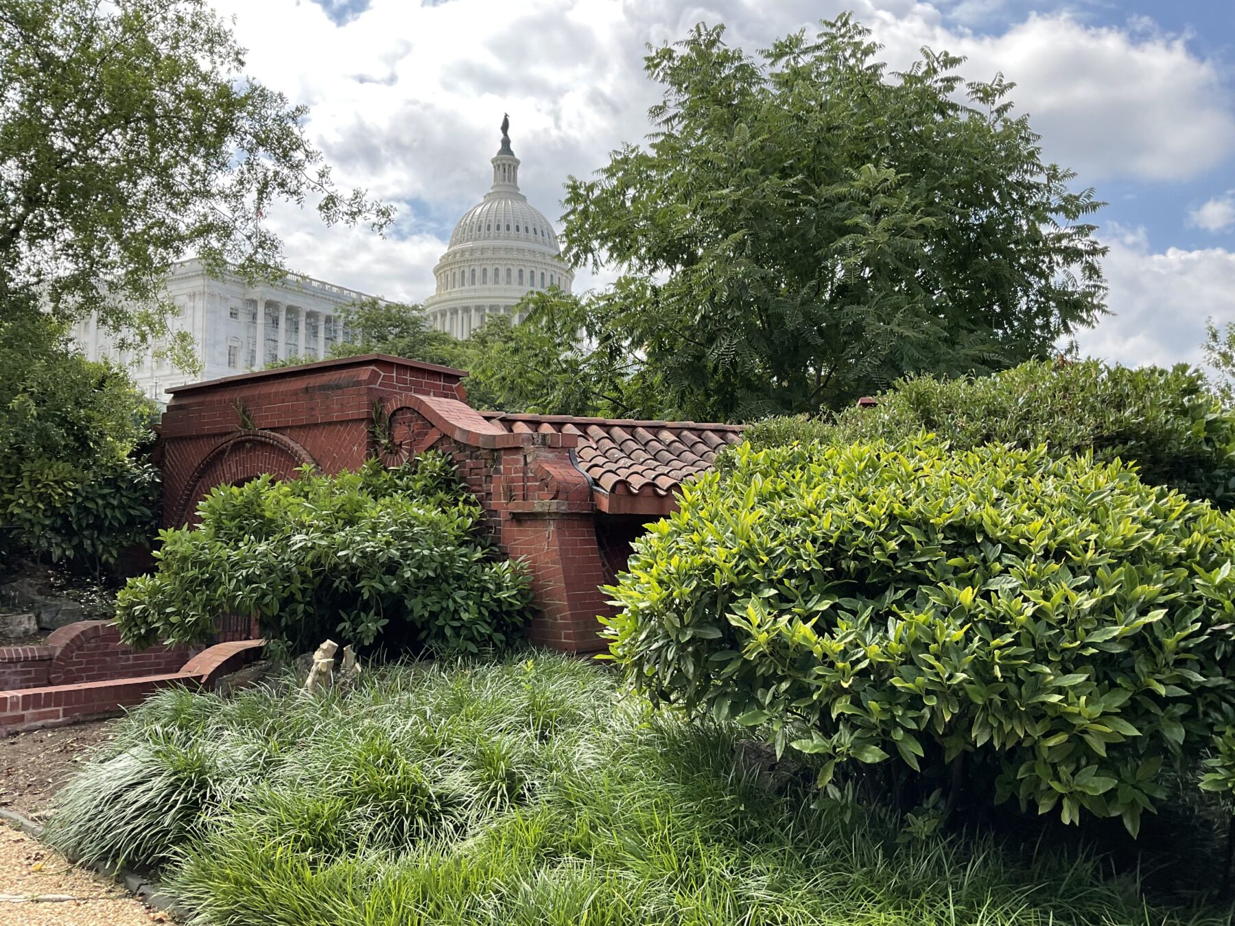
Olmsted’s 1874 design for the U.S. Capitol created comfortable pathways and arranged plantings to guide pedestrians, separate people from carriages, and frame views to the Capitol’s dome
Fast forward and change contexts, and Dorothy’s directive takes on a new life. In 2015, Sasaki began working with Virginia Tech on an ambitious new campus master plan that proposed over 1 million gross square feet of new buildings on campus. The impact of such a significant design strategy required a new way of thinking about the campus environment and experience. As it turns out, every project is an opportunity to “be more creative and check our default.”
Virginia Tech’s landscape had been largely untouched for decades. It still reflected the university’s former identity: a military institution where moving from your dorm to your classroom as quickly and efficiently as possible was a primary design driver. The result? A campus landscape with straight, direct pathways and few benches or opportunities for rest. A study of existing landscape types revealed that 17 percent of the campus was this type of physically challenging interstitial space without a “there there.”

Before: while the 300+ stairs at Virginia’s Tech’s existing campus might have made sense as a response to the topography, they rendered large parts of the campus inaccessible to those with mobility challenges
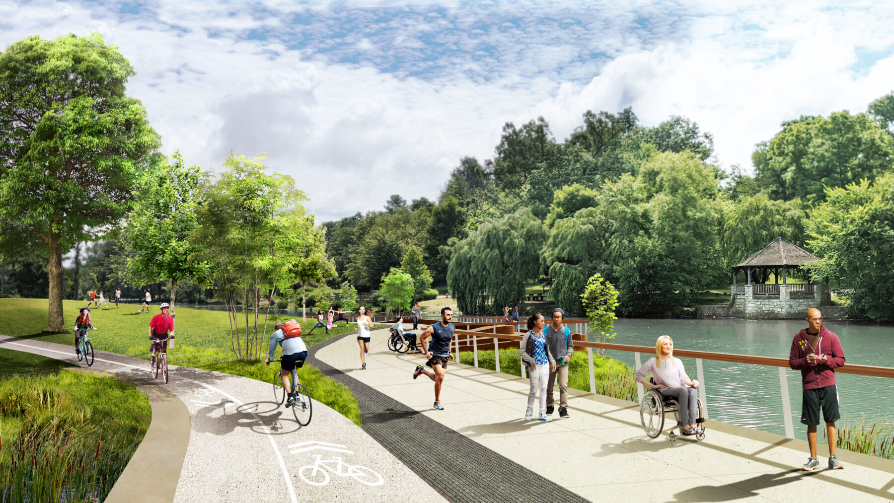
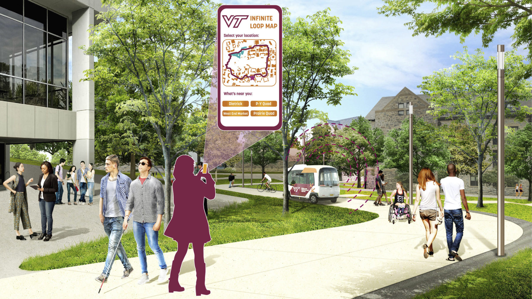
After: in response to the campus’s largely inaccessible topography, the Sasaki design team conceived of two landscape systems that ushered in a new design language on campus
The Virginia Tech campus sits in the Appalachian Mountain Ridge and Valley region, and the landscape is a product of its regional geology. Perhaps unsurprisingly given the hilly terrain, there were 376 stairs to contend with on the core campus. But while these stairs might have made sense as a response to the geography, they rendered large parts of the campus inaccessible to those with mobility challenges.
In response to this largely inaccessible topography, the Sasaki design team conceived of two landscape systems that ushered in a new design language on campus. This design approach signaled a culture shift in the campus experience, one that was embraced by the university’s disability caucus.
The Infinite Loop is the first new design system: a 2.5-mile multi-modal pathway connecting Virginia Tech’s most historic buildings, its present day vibrancy, and future development sites. Complementing the Infinite Loop is a 3.5-mile network of accessible pathways and places that maneuver between buildings, called the Green Links. Together, the Loop and the Links eliminate those 376 stairs, and in their place create meandering pathways at 5 percent slope wherever possible. They add seating areas every 150 feet along the pathways per Universal Design standards, and create a chance to reimagine quads, courtyards, plazas, programmable places, and stormwater management opportunities throughout campus. It amounts to a near-complete retrofit of the core campus landscape that the university is building, one piece of the puzzle at a time. The culture shift is real, and it’s one the university is admirably embracing as it continues to grow and evolve.
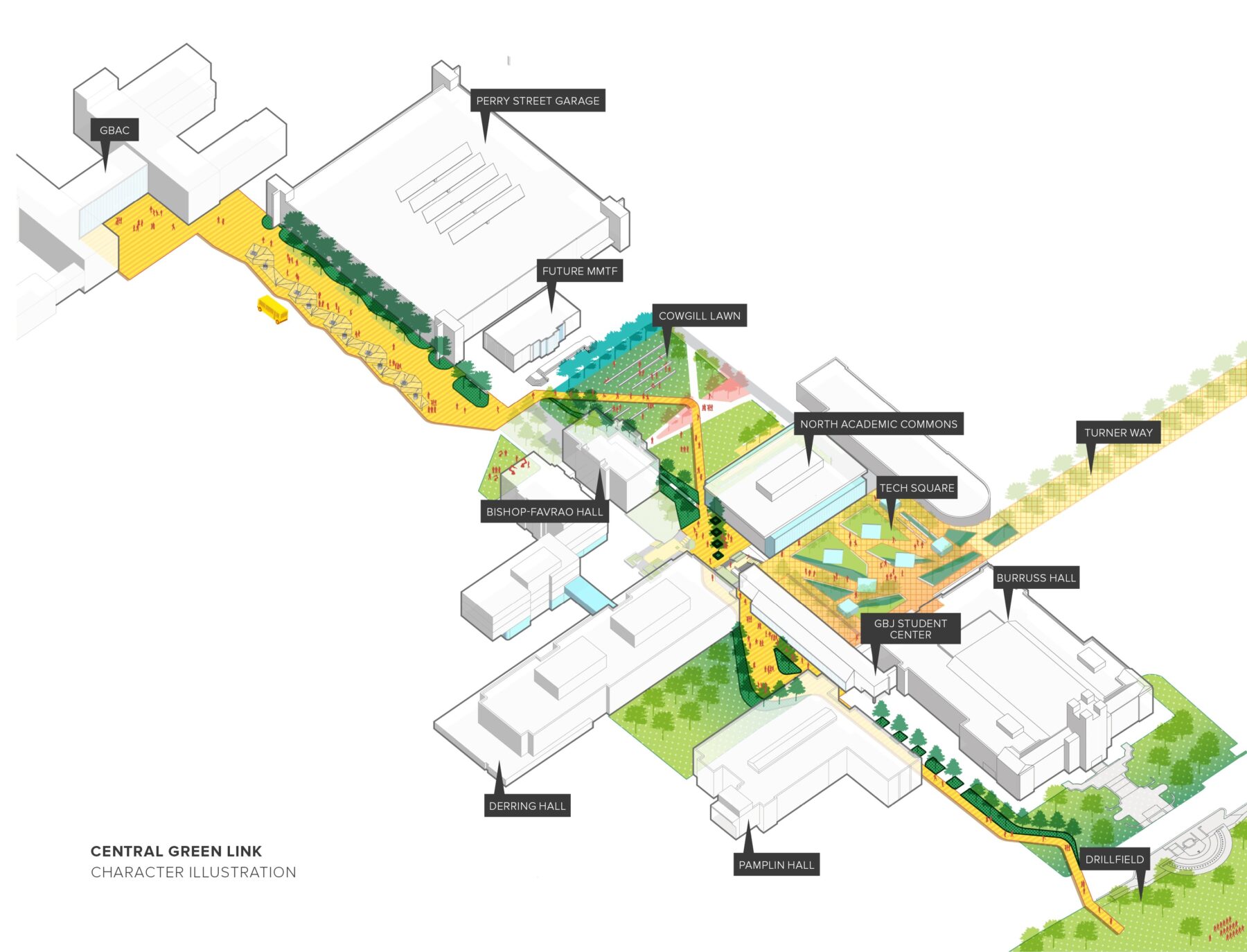
Green Links
UMass Boston and Virginia Tech are just two examples that display our approach to human-centered design at Sasaki, which is inspired, intersectional, and implementable. We value the process as much as the product, so to us, successfully changing our default means embracing new ways of collaborating, such as strapping on VR goggles for on-site design meetings with clients, translating sketches and diagrams to braille, and building full-scale models in our fabrication studio to invite users of all abilities to interact with the design and make collective decisions. We believe that investing in an immersive and tactile design process ensures that details translate to the built environment. In our world, the analog and the digital can come together to create an authentic design and an experience centered on understanding. There’s something for everyone.
We believe that investing in an immersive and tactile design process ensures that details translate to the built environment.
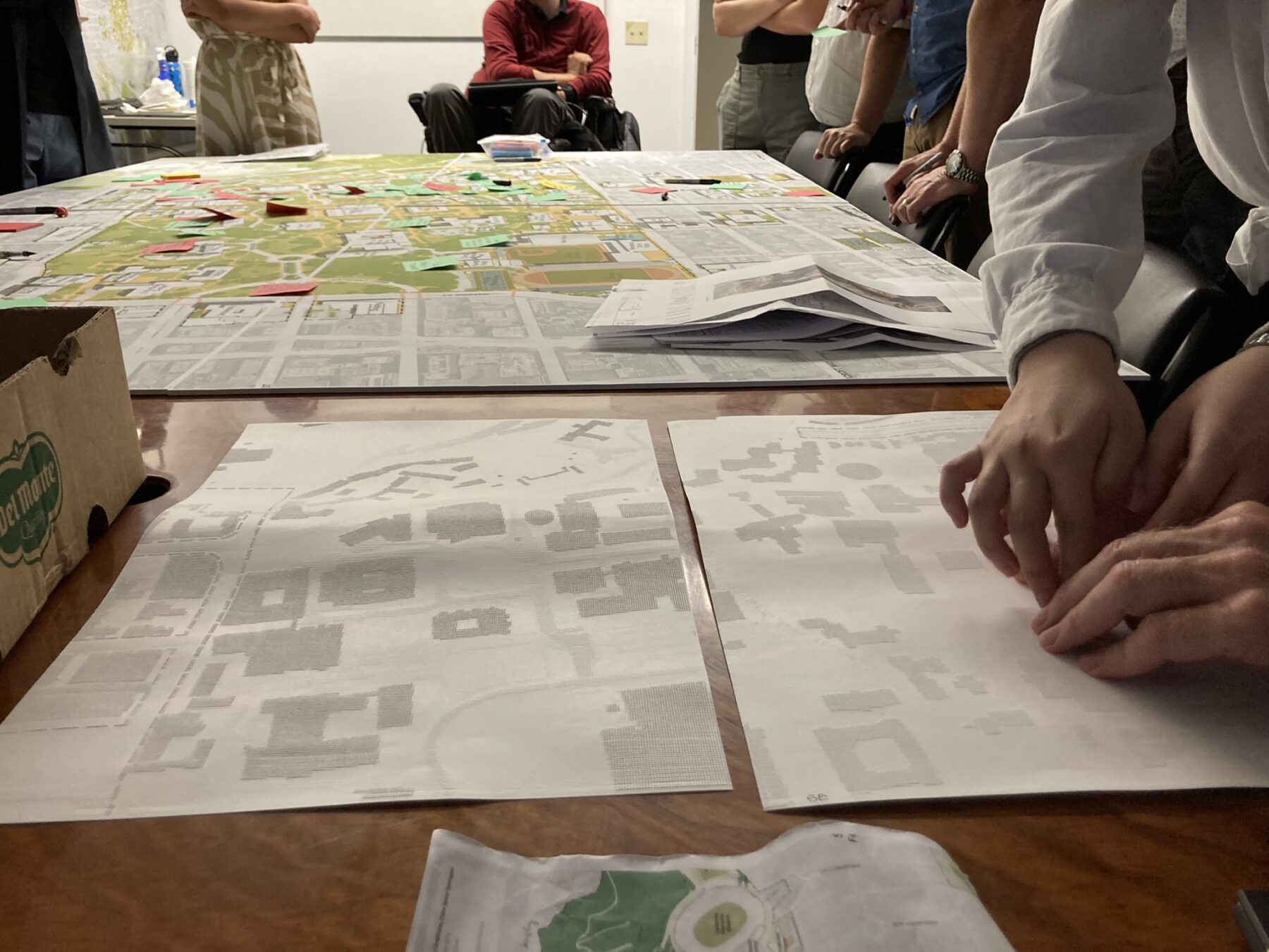
Converting a plan into braille
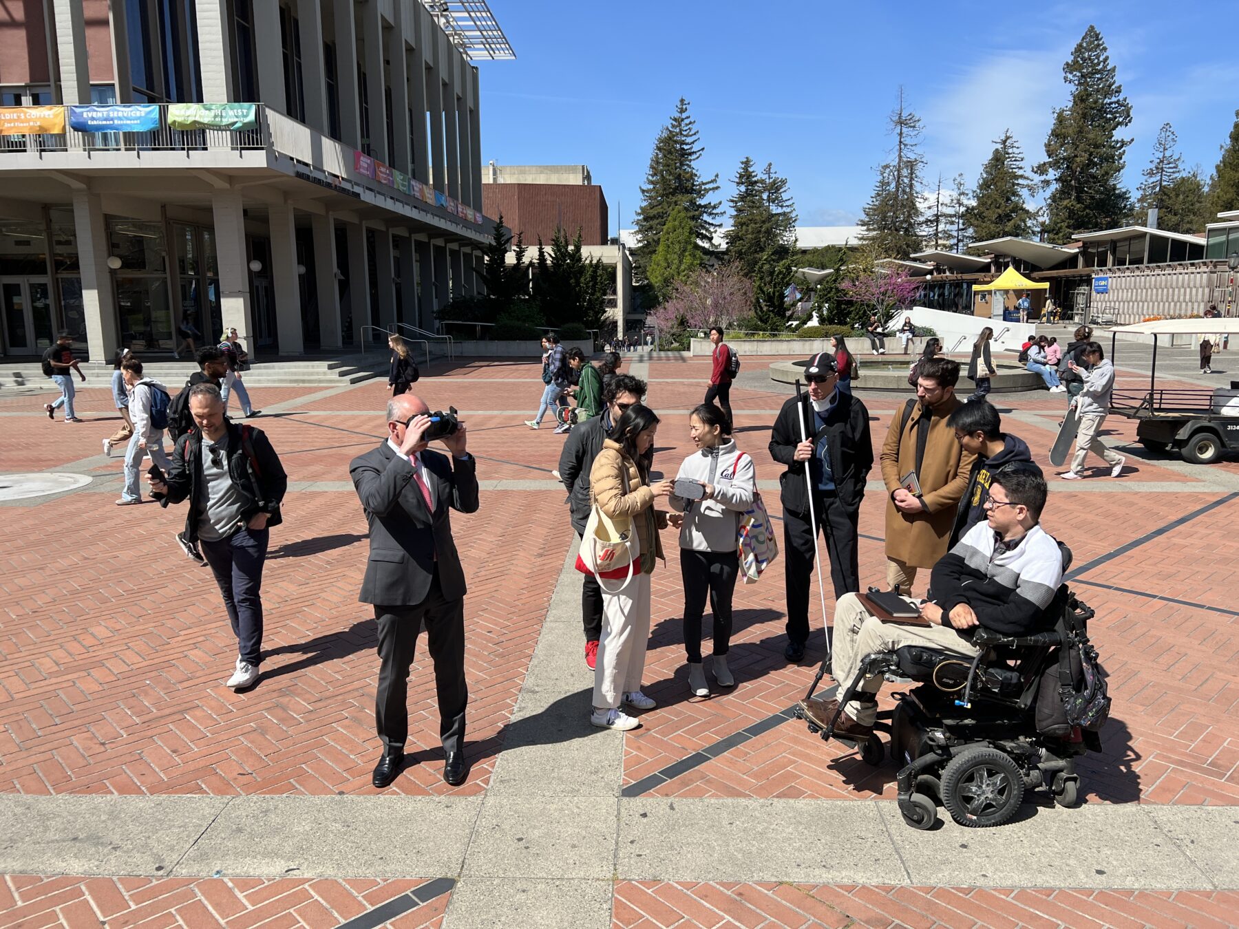
Using VR during the design process
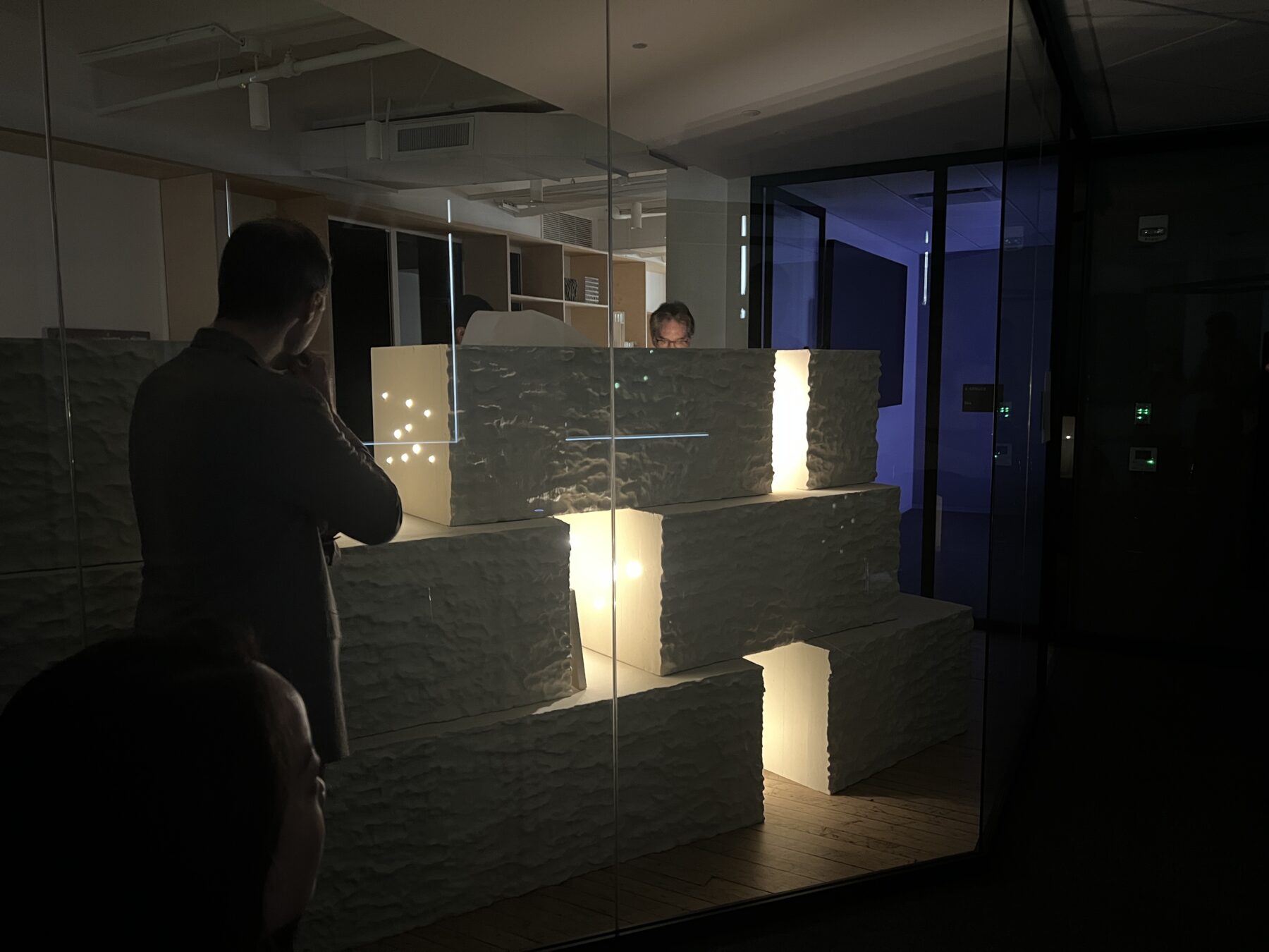
Interacting with full-scale design mockups
“Be more creative; check your default.” Don’t just lean on the same old tools you’ve always used. Innovation, according to Dorothy, should generate equity. Isn’t that something we all should aim for?
Sasaki landscape architect Ian Scherling led a tour through the site, pointing out key design features
Too often in the design world the term “accessible design” is an epithet for meeting the minimum requirements put forth by the Americans with Disabilities Act (ADA). Learn how Sasaki designers are reinventing inclusive best practices that aim to create spaces suited for all users
The transformed Plaza will serve as a welcoming civic heart for generations of Bostonians